An Easy Paint Color Strategy for the Whole Home
Today, I thought I would talk about an easy way to choose a paint color strategy for the whole home.
***All the images in today’s post are colors found in today’s color palette. The name and brand of the paint color is directly below the image***
Smoke by Benjamin Moore
Of course, most of us can’t paint every room in our home all at one time. If you’re building a new home or remodeling, you’re probably going to have everything painted at one time. Either way, having a long term plan for an overall color palette can help you tremendously as you move room to room and change paint colors. If you choose an undertone or two ahead of time, this will help you room to room because you have something to guide you in your color choices. This is especially important if your home is more of an open concept.
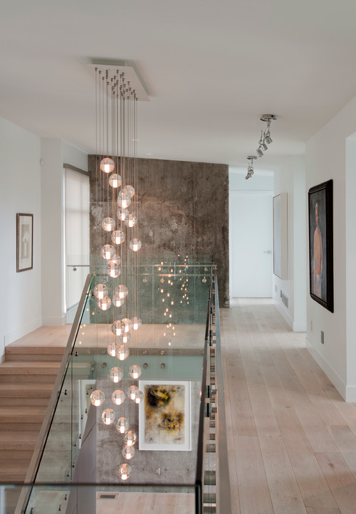
 Wall color on right is Cloudy Sky and stairway wall is Smoke (Benjamin Moore) Source: Benjamin Moore
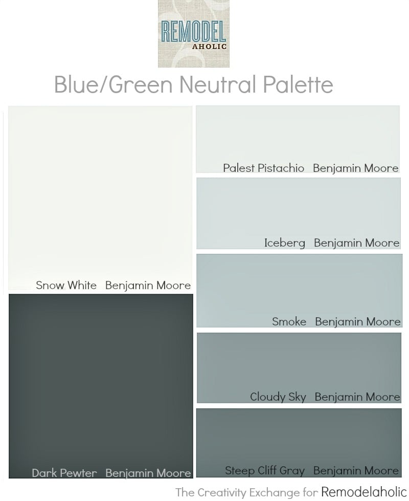
One of the best tricks to ensure that all of your undertones will work together is to work off of one paint card. I have worked with color for more than 25 years but I still find myself working off of one card to guarantee undertone and color matches room to room in my home. I just choose different shades on the card for ceiling, trim, doors and the various rooms. Today’s color palette that I’m feature are all shades found on one Benjamin Moore paint card/strip:
If you are going to work off of one card in your home, the lightest shade on the card is the perfect ceiling color or trim color throughout the home. As you can see in this paint card below, Snow White is a light white that has the blue/green/grey undertone found in the rest of the colors on the paint strip:
 Snow White by Benjamin Moore. Source: Benjamin Moore
While “Snow White” looks on the card to be a very light green, it’s very white and what you’re seeing is actually the pure undertone. On a wall, Snow White looks like a standard white and the green/blue undertone is very subtle. But we all know, whites can have all kinds of different undertones but the lightest white on the strip will have the color undertone for the whole strip. Here is Snow White painted on a wall to give you an idea:
Snow White by Benjamin Moore
The darkest color on the paint strip is ideal for interior door and trim colors if you prefer a dark trim. If you want a darker room, entry or a darker wall accent color, the second to the darkest color is a great color to consider. In this case, the color is “Steep Cliff Gray”:
Steep Cliff Gray by Benjamin Moore
The rest of the colors on the paint strip can be used interchangeably for wall colors, kitchen and bath cabinet colors, etc… You can also use the same paint strip to choose furniture paint colors as well! If you work off of one card, you no longer have to agonize about color choices and your only choice is what color to choose out of the seven shades on the card. You can always veer off the strip if you want to choose a different color altogether and if you choose another color that has the same basic undertone as the rest of your home, you know the colors will work together.
If you’re looking for more paint color inspiration, you can check out my “Pick a Paint Color” Board on Pinterest here, where I have almost 400 names and brands of colors painted in spaces. Of course, you can always find me on my blog at The Creativity Exchange. Thanks for stopping by today!
Cyndy
————————————
See more paint palettes and paint colors in our Color Files
Tips for decorating with Pantone’s color of the year
Cyndy is a color expert who has transitioned from the fashion world to the design world by helping others choose just the right paint colors for their homes. Cyndy takes the guesswork out of choosing paint colors and has been sharing her tips and paint color palettes with her readers for more than four years on her blog The Creativity Exchange.
Cyndy lives in East Texas and is an artist working with designers to create commissioned paintings that enhance the color and design of a space.


Your post couldn’t of come at a better time. We’ve done a total gut on our home and 3/4 of the sheet rock is hung. I have to choose all the colors for the home by next month. With our new open concept I find this a daunting task. Thanks for your tips.
Beautiful colors. I love them 🙂
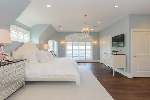
I have used this strip in staging homes as well. Smoke is absolutely beautiful in a master bedroom!
I like these colors! 🙂
How do you find a card with the same undertones of a paint you already have. We did a beautiful gray upstairs but the color is discontinued now, and I would like to find a color that flows well for the downstairs
I have been trying to figure out how to tie rooms together for the longest time. It all makes sense now! How easy!!!
So glad to help, Helen! Cyndy is an amazing resource with so many great tips like this!
Hi, just new to your blog, found it through Pinterest. Great advice, thanks much. We are in the process of building a house and I am in love with BM Iceberg ( used it in the last house with Chantilly Lace trim and cabinets). So, the main floor should be fairly easy now that I read your advice for using the colours on the same card in different rooms of the house. My problem, however, is the basement. Our 15 yr old daughter will have her space there and would like cream walls with the same white trim. She does want blue accent colours but wondering where to find cream that will be cohesive with the house? Any advice would be greatly appreciated. Thanks again!!!????