Reader Question: Mid-Century Cape Cod Curb Appeal

If you follow Remodelaholic on Facebook, you’ve probably seen several of the reader questions that are submitted every month. As I’ve mentioned in the past, I love the helpful community vibe of these posts, so here’s my two cents on one reader submitted question and a mock up of what I would do if I were in your shoes! (Pssssst— you can submit your reader questions by messaging Remodelaholic on Facebook!)
First though, my disclaimer: While I can recommend ideas that I think look nice, I have never seen this house in real life and don’t have accurate measurements. I am also not an architecht or landscaper and do not know the planting recommendations for your area- I just like to make things look nice. I can’t guarantee that any of the items I put in my ‘virtual’ design will actually work in real life (or that they’ll fit your design style for that matter), and this is not intended to be a professional design consultation. So think of this as a just-for-fun rendering that hopefully gets your wheels turning and provides some inspiration!
READER QUESTION —
I just stumbled upon Designing Dawn’s Adding Colonial Curb Appeal and am so wowed! I loved all of her ideas and inspiration pics! I am hoping for some of that same magic for our little home. We have a really awkward midcentury Cape Cod with a difficult color scheme: pinky orange brick, a rust colored roof, and white siding on top half of the house! After two years of living in it and a million pins, we cannot seem to find a good plan for bringing it up to date or a new color scheme. Is there anything you could suggest for this ugly duckling? Many many thanks for such a fantastic website!

I LOVE this little house! I chose this reader submitted question this month because I think this house has so much potential and really wouldn’t require much to spiff it into the cutest little Cape Cod you’ve ever seen.
The other reason I chose this one is that the Cape Cod style of home was very popular from 1920 to about 1960. Hundreds of thousands of these Mid-century style homes were built across the country throughout the 1950s, so these style of houses are found in basically every neighborhood that’s more than 50 years old. Meaning that I think a lot of people out there may be struggling with similar curb appeal questions about their own Cape style house.
Cape Cods are generally pretty symmetrical, but during the 30s and 40s, several were built with less strict symmetry than their earlier counterparts, and it looks like your home is a great example of that style. Despite the style, Cape Cod homes are charming and timeless, and I couldn’t wait to get my hands on this Mid-century beauty!
To start with, I scoured the world wide web for some prime examples of this style done well:


Lovely right? It doesn’t get much more inspirational than that. Something that I picked up from all these images is the fairly traditional look. This style became popular because the houses were small, affordable, and traditional, so I think sticking with a traditional style is a good bet for increasing curb appeal. With that in mind, here is what I came up with for this little gem:

Did you have to scroll a few times to make sure it was the same house? The transformation is pretty stunning right? One of my favorite mock-ups yet, the changes here are really not as major as they first appear. I’ll break it down for you.
First off, a good majority of the inspiration homes I found had shutters. Since this home already had shutters on one window and the door, I ran with that, but removed them from the door and added them to the second window in the front to balance the facade. I also ‘painted’ them a deep black color to help tone down the brick, add a more traditional feeling, and tie in the mailbox. While we’re on the subject of windows, this is the perfect style of home for some decorative window boxes. Add them pronto!
The next change I made was to the roof. The rusty color of the current roof is really making the bricks look orange, when in fact, they’re a very beautiful color. If changing out the shingles isn’t enough, I would try painting them. Yes, that’s apparently a thing! While I have not tried it myself, so can’t vouch for the durability, a little research popped up special roof paint that seems to have good reviews. I’ll link to that in the sources below. Just changing the shingles and the roof to get rid of the maroon/rust color would instantly help the curb appeal. Obviously I didn’t stop there though.
I removed the dated decor over the front door and replaced it with some streamlined black address numbers, again tying in the color of the shutters and mailbox. I also updated the porch light to a larger option with a traditional look. Next I switched out the front door for a more decorative option that ties in both the paned windows and the decorative corbels under the eaves of the house. I would go with a cool turquoise color to make the door pop out from the warm brick. Do you see how it makes the entry the focal point and feels very inviting? If possible, adding sidelights to the door would create a much grander entry that fills the space of the portico nicely.
Next, I ‘painted’ all the trim bright white and the peak a very soft cool gray color. That slight contrast is important, because I think an all white paint job would make that area stick out like a sore thumb, while a too-dark option would make it recede and the house look smaller. With a slight contrast though, it is noticeable and interesting without being overpowering. It perfectly contrasts what’s going on with the rest of the house.
The final bigger change I made updating the path to the front steps. Many Cape Cod style houses have decorative walkways of brick or stone, so incorporating that will tie in with the style, as well as bring some of the warmth of the house color down to balance everything out and make the home look more grounded. I also used a simple brick border around the planting beds for the same reason, as well as to clean them up and make them feel a little more symmetrical.
Finally, I just filled in the landscaping with black mulch to tie into the other black accents, added a few more colorful flowering plants to tie to the window boxes, and two decorative black planters on the steps.
Voila! A whole new house! As promised, here is a list of sources I used in my mock-up:
This post contains some affiliate links. Please see our full privacy policy and disclosure here.

Roof Paint
Planters
Porch Light
House Numbers
So what do you think? What would you have done to spruce up the curb appeal of this Mid-Century Cape Cod?

As always, thank you to Cassity and the Remodelaholic team for having me back each month. If you like this post, and have a design dilemma you’d like me to mock up some ideas for, let me know! Ask your questions by sending Remodelaholic a message over on Facebook.) Also I’d love for you to visit me on my blog, DesigningDawn.com, or follow me on Facebook, Pinterest, or Instagram. Have a great day, friends!
-Dawn
See more from Dawn:
|
|
|
|


—————————————–
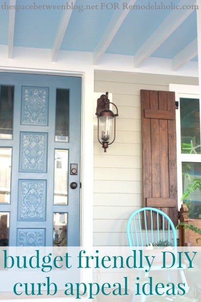
More curb appeal ideas:

Dawn is one half of the team behind the creative blog, AD Aesthetic. By day she works as the VP of Creative for a design and marketing company (getting paid to make things look good!), while by night she renovates her Midwest home, refinishes thrift-store furniture for fun, and works with her husband on raising two tiny humans. Dawn believes in the potential to design your surroundings and your life one day at a time, and lives by the motto, 'Make everything beautiful.' Get to know her better by visiting her blog, ADaesthetic.com, or following along on Facebook and Instagram.


This was AMAZING! So inspirational! I knew I had come to the right place when I found the *exact same* pictures of Cape Cod curb appeals as the examples in this post! I just loved it! (Sorry for all the “!” 😉 ) Thank you for the post… I love your taste and should probably submit a picture of my house to be able to get some feedback. Much appreciated! <3
How much do you charge to do this to my house?
Hi Nicole,
You can see Dawn’s design rates for mood boards and virtual mockups over at her site, AD Aesthetic: http://adaesthetic.com/portfolio/
Hi – What color paint is the blue/turquoise on the door? I can’t seem to find in the post. Thanks!
Hi Emily — the paint swatch is listed in the sources, and it’s Valspar Halcyon Blue. Thanks for the comment!
What is the cool gray color you used for the siding? I love it!
Thanks, Ashley! Since this is just a virtual mockup, we don’t have a specific paint color for that section, but Coventry Gray like we spotlighted here or Silver Strand as spotlighted here look like close matches on color. Hope that helps!
What color would you suggest painting if this house sit on a block foundation just curious.