Real Life Rooms: Curb Appeal from Plain to Pretty
Hey there Remodelaholic readers! Dawn here, from AD Aesthetic, and I’m back this month with another reader question mockup to hopefully inspire some creative ideas for your cost effective curp appeal update. If you’ve missed any of my previous reader question mockups, you can always see all my posts here.
If you follow Remodelaholic on Facebook, you’ve probably seen several of the reader questions that are submitted every month. Well each month here on Remodelaholic, I choose one reader submitted photo to offer my two cents on, and I create a Photoshop mock up of what I would do if I were in your shoes! (Pssssst— you can submit your reader questions by messaging Remodelaholic on Facebook, and if you want to get chosen, please be sure to include a good quality photo!)

First though, my standard disclaimer: While I can recommend ideas that I think look nice, I have never seen this house in real life and don’t have accurate measurements. I am also not an architect or landscaper and do not know the planting recommendations for your area- I just like to make things look nice. I can’t guarantee that any of the items I put in my ‘virtual’ design will actually work in real life (or that they’ll fit your design style for that matter), and this is not intended to be a professional design consultation. So think of this as a just-for-fun rendering that hopefully gets your wheels turning and provides some inspiration!
On to the fun!
READER QUESTION from Erica —
Can you help add some curb appeal to our sad and dated home? After some heavy weather we lost the awnings across the front (I was happy to see them go) but it unexpectedly took our house from dated to plain and painful. Please help!
More likely than not we will not be replacing the storm door but we are open to all suggestions. Thank you!

This little house is so cute, and really a blank slate! It reminded me a ton of one of the very first (and most popular) curb appeal mockups I did here at Remodelaholic. In that post I also talked a bit about the history of this Mid-Century Cape Cod style of home, which was very popular from 1920 to about 1960. You can check that one out here if you’re interested, but for this home, I wanted to challenge myself to go in a little different direction and come up with a new look (even though that meant deviating a bit from the traditional style of this home). First though, I naturally scoured the internet for some inspiration and ideas. Here are a few that I loved:
Curb Appeal Inspiration


With all that curb appeal inspiration, here’s what I did to turn this home from plain to pretty:

Sources:
contains affiliate links; see our full disclosure policy here
House Numbers | Porch Lights | Planters

Curb appeal tips to take your home from plain to pretty
Depth adds visual interest
The main downfall of this cute little home’s curb appeal was the lack of depth. The entire front of the house is basically one flat surface, which makes it feel characterless. While the previous awnings would have provided some depth, their removal left the house feeling a bit bare. Adding on a small porch is a great solution here because it not only solves the depth issue, but also a few other issues that I’ll address below. In addition to the new porch, dark shutters give the windows a larger footprint, and add some depth of tone to the home, making the white trim pop and the beautiful brick work shine.
Color ties everything together
As I mentioned above, the entire front of this house is essentially a flat surface, that suddenly breaks from brick to white siding at the peak. This naturally makes the peak of the house stand out and feel like it’s not really tied to the rest of the home. Adding additional white elements such as a new white porch railing and ceiling, helps to bring some of that bright color down to the lower half of the home, grounding it and making everything feel cohesive. Similarly, the new black shutters help tie the smaller window of the home’s peak, to the larger windows of the first floor. Since none of the windows on the front of the home are the same size, adding a unifying feature to all of them helps tie them together and makes the house look cleaner.
Similar shapes provide consistency
In addition to being the only area with siding, the peak of the roof was also the only element of the home that broke out of the boxy shape. Adding a second peak above the porch not only adds more white to the overall color scheme, but it also provides a second break-out of the boxy square features of the home, helping to make the original peak feel more in tune with the rest of the home’s facade.

So what do you think? What would you do if this were your home?
As always, thank you to Cassity and the Remodelaholic team for having me back each month. If you like this post, and have a design dilemma you’d like me to mock up some ideas for, you can ask your questions by sending Remodelaholic a message over on Facebook, or checkout my mockup design services over on my site adaesthetic.com. And be sure to follow me on Facebook, Pinterest, or Instagram and say hello! Have a great day, friends!
-Dawn
More curb appeal update ideas:
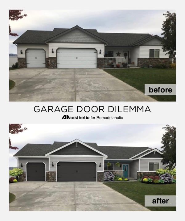
Garage Door Update to Add Curb Appeal
Colonial Home Exterior Curb Appeal

Single Level Colorful Home Exterior Update

Adding a Porch to Add Curb Appeal

Two Story Curb Appeal Exterior Update

Small Split Level Home Exterior Curb Appeal Ideas

Neutral Desert Home Exterior Ideas

Dawn is one half of the team behind the creative blog, AD Aesthetic. By day she works as the VP of Creative for a design and marketing company (getting paid to make things look good!), while by night she renovates her Midwest home, refinishes thrift-store furniture for fun, and works with her husband on raising two tiny humans. Dawn believes in the potential to design your surroundings and your life one day at a time, and lives by the motto, 'Make everything beautiful.' Get to know her better by visiting her blog, ADaesthetic.com, or following along on Facebook and Instagram.


It never fails to amaze me how much simply painting your front door can do for the exterior aesthetics of your house. Although I do think the yellow door on that first house looks a little off.